plot.plot_compare
plot_compare(grid1, grid2, clip, lon=None, lat=None, az=None, basemap=True, savefile=None, show=True, title="", contours=None, dtype=None, label1=None, label2=None)
Makes a comparison plot between two grid files with cross-sections.
Arguments:
grid1 (xr.DataArray or str): first grid object.
grid2 (xr.DataArray or str): second grid object.
clip (pd.DataFrame or str): clipping mask to use.
lon (float, optional): cross-section longitude. Defaults to None.
lat (float, optional): cross-section latitude. Defaults to None.
az (float, optional): cross-section azimuth angle. Defaults to None.
basemap (bool, optional): plots basemap. Defaults to True.
savefile (str, optional): path to save output to. Defaults to None.
show (bool, optional): display the figure in output. Defaults to True.
title (str, optional): adds a title to the figure.
contours (xr.DataArray, optional): grid object for reference contours. Defaults to None.
dtype (str, optional): data type of contours being plotted. Defaults to None.
label1 (str, optional): label for the first grid. Defaults to None.
label2 (str, optional): label for the second grid. Defaults to None.
Returns:
None
Examples
import plot
# load in the Cascadia model as a slab_model instance
model1 = plot.slab_model("../output/cas_slab2_04-18","surface") # synthetic test slab made with the 04-18 database
model2 = plot.slab_model("../output/cas_slab2_07-24","surface") # synthetic test slab made with the 04-18 database
# making a comparison plot below
plot.plot_compare(
    model1.dep_grid, # depth values for the first model
    model2.dep_grid, # depth values for the second model
    model1.clp, # clipping mask from the first model
    lon=None, # cross-section longitude - auto-assign
    lat=None, # cross-section latitude - auto-assign
    az=110, # cross-section orientation
    basemap=True, # plot the basemap below
    savefile="output/cas_slab2_comparison_04-18_07-24.jpg", # save the figure to a jpeg file
    show=True, # display the figure output
    title="Slab2 Cascadia Models Comparison", # add a title to the pot
    contours=None, # use this to add contour lines
    dtype=None, # specifies data type of contour lines being overlayed
    label1="Cascadia with 2018 Data", # label the cross-section line for the first model
    label2="Cascadia with 2024 Data", # label the cross-section line for the second model
)
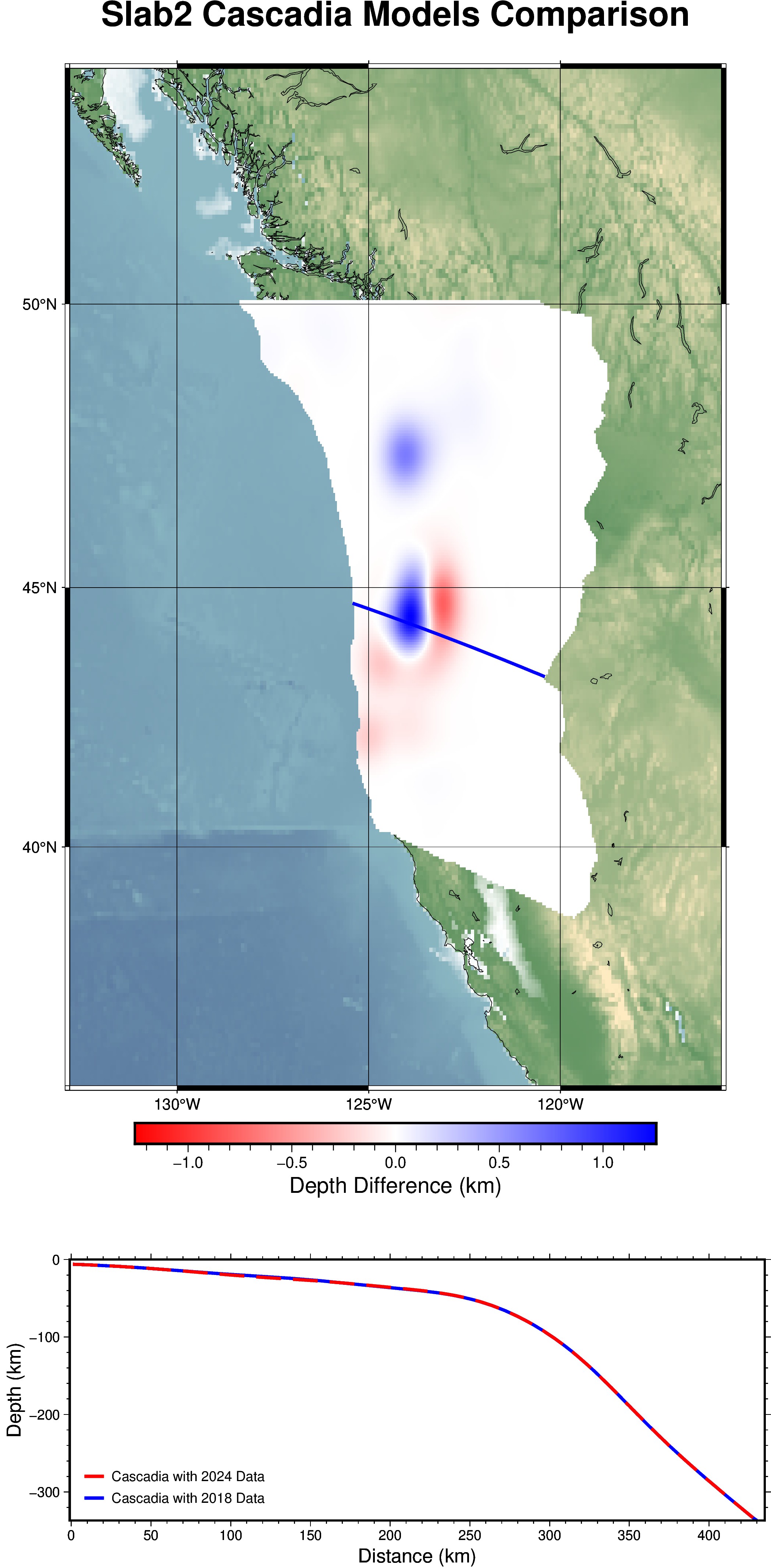
Output of example shown above