Quality assurance
Ursa completing without error does not imply that the results are fully valid. A user is expected to undertake quality assurance to ensure that the simulated results make sense for any given experiment.
The following diagnostic plots and files are provided in the qc directory to support quality assurance activities. Depending on the specific application, other aspects of result evaluation may be necessary.
benchmark
The benchmark directory holds various figures and plots that were created based on the benchmark files within the benchmarks directory, with a primary focus on the runtime of each task. The plots subdirectory contains plots displaying the runtime of the jobs within the workflow broken up into different categories (pre-setup.png, setup.png, runs.png, postrun.png). All of the plots use seconds/square kilometers so that runtimes between experiments can be compared. The other plots created, categories.png and comprehensive.png, show the timing of the workflow as a whole, whether it be by total time of a category or by individual task. Note the log-scale for time in these two plots, since the runtime for tasks varies greatly between simple setup jobs, or running an entire simulation for a region.
passfail
The passfail directory contains plots regarding to simulation success rates based on either run parameters (e.g., rainfall intensity) or region. This directory also contains information about the maximum courant number within the same groups.
Below are the plots that are featured within passfail with an explanation of what each represent:
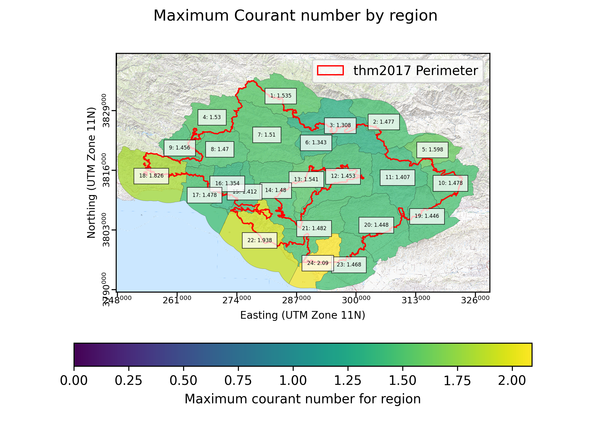
Fig. 7 An example of a maximum courant number by region plot created for a simulation of the Thomas fire.
In the region based plot, the region’s value is decided by finding the maximum Courant number from any individual grid cell for all computational timesteps within each region. It is preferable that the Courant numbers are all below 1.0. However, our experience running and quality controlling simulations indicates that it is common for single grid cells to briefly have a larger Courant number. We suggest that this plot be used to identify regions for additional quality control.
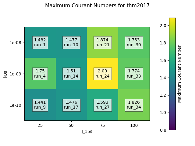
Fig. 8 An example of a passfail ratio by region plot created for a simulation of the Thomas fire.
In the parameter pair plot, the maximum value is found by finding the largest Courant number for any simulation that shares a rainfall intensity (I15) and permeability (kr).